Porirua Revitalises
Text by Helen Frances. Images by David St. George
SMALL CHANGES TO LANDSCAPE and architecture are lifting spirits in the centre of Porirua city. A colourful kiosk, greenery and street furniture inject a friendly, relaxed, more contemporary vibe. The changes are part of a long-term plan to revitalize the central city.
“It’s an exciting time for Porirua,” said the city’s mayor, Nick Leggett. “I think we’re poised for the next wave of change here.”
Since its construction in the 1960s the life of the city and use of the buildings has changed considerably. A mall, a mega centre and the north city centre were added in the 1990s. Sail canopies were erected to create a sheltered shopping area. But over time the central city lost vitality and some parts became downgraded due to vandalism and changes in consumer and business activity.
Mayor Leggett said aspects of the city centre had reached their use by date and the city needed to open up.
“The jewel in our crown is the harbour and we have turned our back on that. What do you do with this big chunk of land and a whole lot of commercial property that is zoned? We’ve got to open them up and connect the CBD down to the stream site and railway station.”
Planning began in 2003 and implementation has proceeded at a measured pace as Porirua City Council and Isthmus Group add new elements and allow people time to acclimatize and respond to the change.
Two years ago, Council engaged a group of people from across the community to activate the space. They introduced green astroturf, some trees, tables and chairs a basketball hoop and concrete table tennis tables, all of which attracted positive energy. The canopies, which were at the end of their life, came down, letting sunlight into the shopping area.
The first phase of landscape development in the centrally located Cobham Court is drawing positive comments.
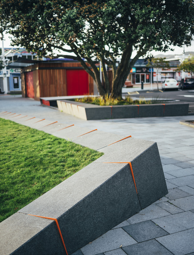
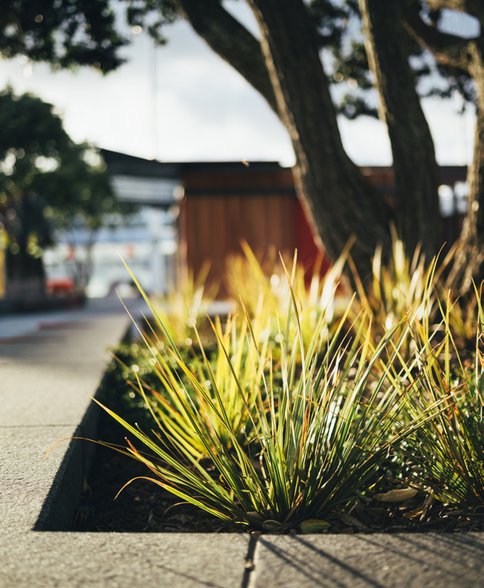
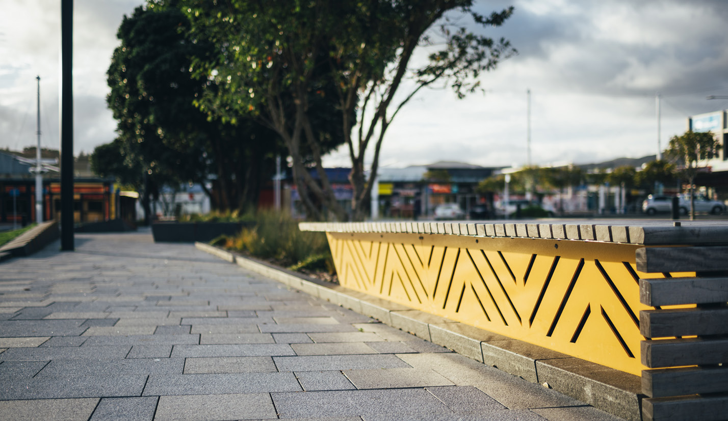
Two established pohutukawa trees within the central area offer shade. Natural timber and new plantings bring softness. Accent colours run from deep red through bright oranges and yellows.
“When they did that, we could see it as an active space where people would congregate and that gave us confidence. It was the initial toe in the water,” Leggett said.
“We thought we should build on that and make something more permanent because it is the city centre, the heart of the city. What can we do to activate it and get more people down here?” added Jane Black, Co-ordinator City Centre Revitalisation. “It’s a lot warmer and lighter. Crime has gone down significantly, and the perception of safety in the area has gone up.”
The first phase of landscape development in the centrally located Cobham Court is drawing positive comments both from members of the community and the police.
Isthmus landscape architects, Andre de Graaf and Daniel Males said they followed three design benchmarks: vibrancy – social as well as choice of colour and materials; distinctiveness – Porirua is proud of its character and identity; legibility – easy for people to find their way around. They have consulted with community representatives and local iwi.
“We’ve been working with Ngati Toa on the overall concept and how they may have a presence in the area through wayfinding, telling some of their stories and also bringing young people into the picture,” Males said.
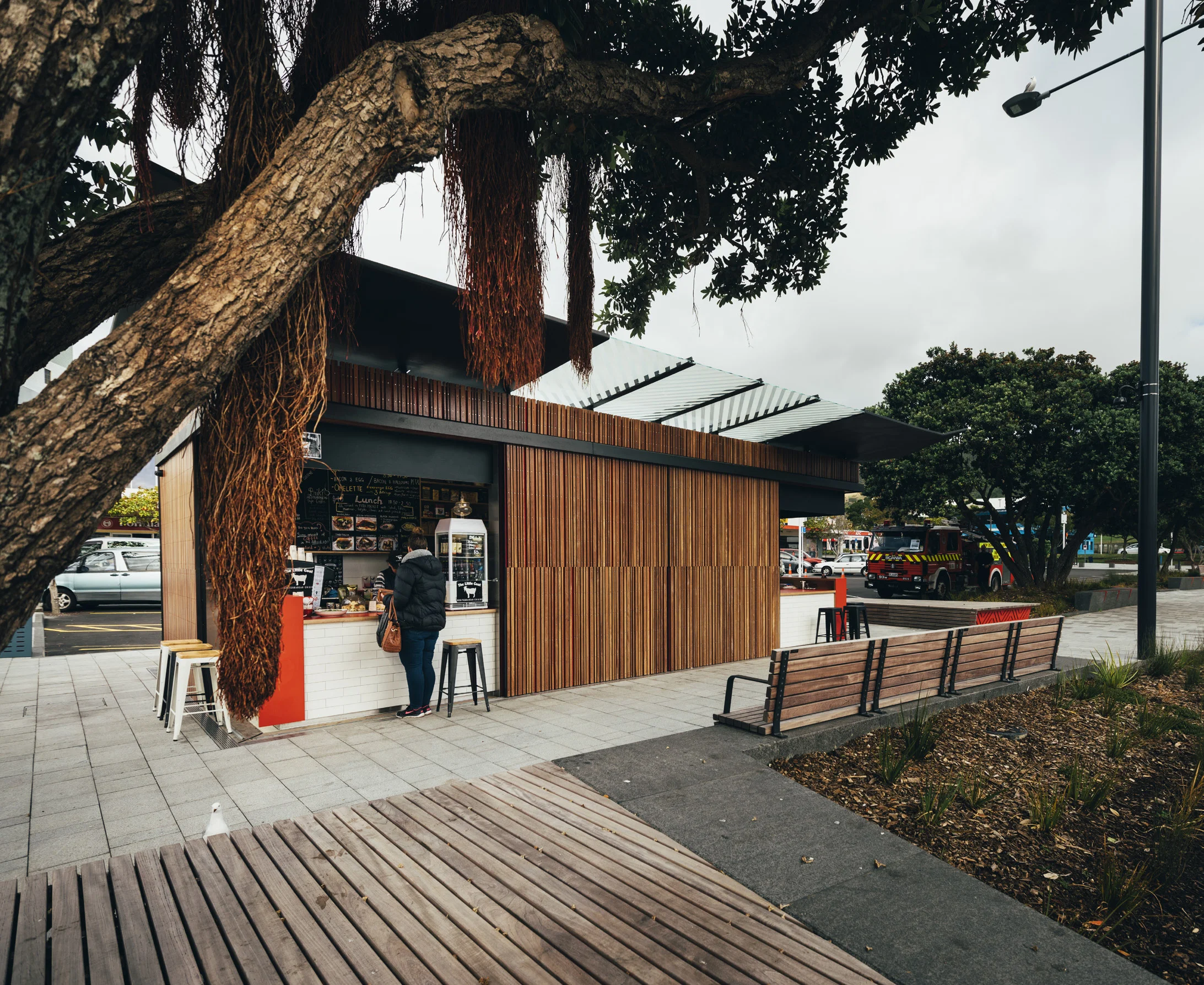
The kiosk combines robust materials with visual warmth and softness, helping to create an inviting, friendly destination.
A row of car parks has been replaced with greenery, seating and a key architectural element, the Porirua Kiosk. The kiosk acts as a beacon in the legibility of the space and in the regeneration of the CBD says Isthmus director, Andre de Graaf.
Clear sight lines were needed to let people know where the heart of the city lay.
“A key issue with Porirua has been that when you drive in, it’s very hard to know where the centre is,” Males said. “The kiosk is a bit of a landmark. The green space we have created clears out visual connections back to Hagley Street — the main street — so drivers can see the activity in the centre. The kiosk is also visible down Serlby Place. We are also looking at getting a much better connection down to Porirua [Kenepuru] Stream. As you drive around, there are points from which you get a view into Cobham Court — into the centre, which has been degraded over the years.”
The kiosk, designed by architect Alistair Luke, won the NZIA Small Project Architecture award in the local Wellington awards in May. It replaces and relocates public toilets, whose location between the bus stops and a bar had attracted loitering and criminal activity.
“The kiosk signals what is possible for the area,” de Graaf said.
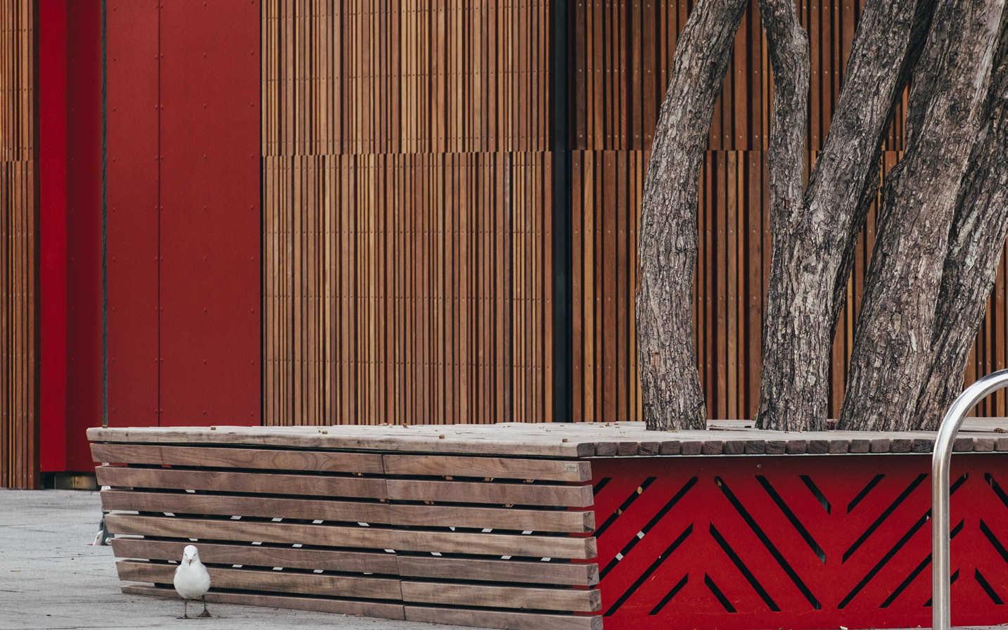
A functional building, with toilets on one side and two food outlets on the other, the kiosk combines robust materials — steel and hardwood timber (cedar and jarrah) — with visual warmth and softness, helping to create an inviting, friendly space. The structural elements are partially exposed, lending “an honesty of expression.” Abstract patterns in timber and on the glass canopy cast shadows reminiscent of palm fronds and the Pacific cultures in Porirua.
Designed by architect Alistair Luke, the kiosk won the NZIA Small Project Architecture award in the local Wellington awards.
De Graaf said colour selection aimed to lift the spirit. Red walls are overlaid with timber, which “brings softness and a sense of wanting to touch the building”.
Red screen doors slide back to reveal a more delicate, white tiled interior that gives the impression of erosion, “the idea of carving away at something.” The interior becomes part of the landscape when the kiosk food outlets are operating. The tenants attract a sociable clientele.
In a material sense, Cobham Court needed to be softer and more inviting, so features such as the tilting of the lawns and further tree planting give more presence to green elements.
“You don’t feel you are in a car park — it is more embracing as a landscape. There are lots of edges to sit on, so on a sunny day you can sit here with a sandwich from the kiosk,” Males said.
Plenty of casual seating options invite pedestrians to stop and linger.
Two established pohutukawa trees within the central area offer shade, and surrounding furniture is made from Purple Heart timber. Seats with red, perforated metal panels around the sides are underlit and glow at night, creating a friendly atmosphere, along with the subtle lighting of the kiosk. Paving is durable granite with two or three colour and textural variations and in different weathers and lights the patterns change. Fins set within stone block edges follow gradients from deep red through oranges and yellows. These fins add vibrancy and deter skateboarders, helping to maintain the social, passive use of the space.
“This a seed project,” Males said. “It’s on a scale that people can buy into and get an idea of what new landscape design could bring to the city. The rest of the project implementation will be measured, not all in one go but in several projects.”
